Mapping the World
Anyone with a fourth grade education knows that North is up and South is down, right? After all, when we travel from New York City to Rochester, NY, we go “upstate,” Alabama is in the “deep” South, and the area comprising the continental United States is referred to as the “Lower 48.” Easy, right?
Hmmm. Not so fast. What if North were down and South were up?
Stay with me here.
Because our earth is round, the challenge for a mapmaker attempting to draw a flat world map is how to accurately represent a round sphere on a flat surface. Due to the multiple judgment calls inherent in this challenge, it turns out that the work of cartography (mapmaking) is really more of an art than a science, and that a cartographer’s product, a flat map, is shaped as much by its creator’s perspective, goals and biases as by actual geography.
So, yes, North and South are up and down, but only because someone (specifically White Europeans) chose to both look at and represent the world in a certain way.
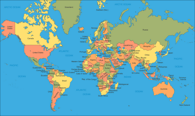
The Mercator Projection (below), the most common world map (you’ll remember it from 4th grade), was created in 1569 by Gerhardus Mercator, a Flemish mathematician and cartographer. Mercator’s goal in drawing this map was to create a tool to help European explorers and traders travel across oceans. To this end, he filled a rectangle with the surface of our spherical earth in such a way that he shrunk some of its details and magnified others, an orientation that resulted in many geographic distortions.
Take Greenland and Africa, for instance. On the Mercator map, these landmasses appear similar in size. In reality, the African continent is actually fourteen times larger than Greenland. Also, since Europe and North America are both distant from the equator, the distortions of the Mercator map make them appear proportionally much larger than they really are.
Why all the fuss about maps, you ask? Well, the perspective used to create a representation of our planet turns out to be really important on a lot of levels.
First, one of the more obvious problems of the Mercator map is that it perpetuates a geographically distorted view of what the world really looks like. And I don’t know about you, but it makes me a wee bit uncomfortable to think that the landmass I live on doesn’t look the way I’ve always thought it does.
But perhaps even more importantly, the European bias of this particular representation (Europe is placed in the center of the world and aligned in the top portion) reflects and favors the location of its European maker and thus has a tendency to encourage notions of Eurocentrism.
After all, the Far East is known as such only because it is far from the person who created the map, a Western European.
Moreover (and here’s where it gets really mind-blowing, people) there is no scientific logic requiring the area we know as the northern hemisphere to be placed on the top portion of a map. But when the northern hemisphere sits at the top and the southern hemisphere at the bottom, our tendency to adopt a ‘top and bottom’ attitude means we might view those at the top of the map (Europe, the United States, Russia) as superior to those at the bottom (Africa, South America, Australia).
The end result of all of this is that the Mercator map has both fostered and supported the common perception that European colonialists, researchers and scientists (and, by extension, all Anglo-Saxon descendants) are always at the center and top of things, not just geographically but also culturally, politically, aesthetically and so on. Because of this, the Mercator map is often seen as a symbol of how White Europeans have a tendency to “other” the rest of the world.
There Are Other Maps of the World
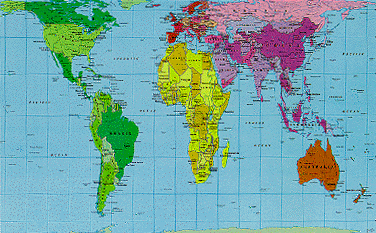
Yes, Virginia, it’s true. In an effort to encourage a more geographically accurate perspective of the world, as well as balance out some of the biases inherent in the perspectives of early maps, some cartographers, sociologists and historians are beginning to work with various alternative maps. The most popular of these maps is the Peters Projection Map, shown below.
This map was drawn by Arno Peters, a German historian and cartographer, in 1974. Peters believes that, although his map still contains distortions, it is a far more realistic and accurate portrayal of the world. For instance, although Europe is still centralized on this map, its size (like the size of other countries) is much more in line with its actual size on the globe.
You might also notice that on this map Africa, now portrayed closer to its actual size, looks like a giant yellow amoeba that is about to swallow the European countries above it in one gulp. Kind of startling, right? CJ Cregg thinks so too, in this great West Wing clip.
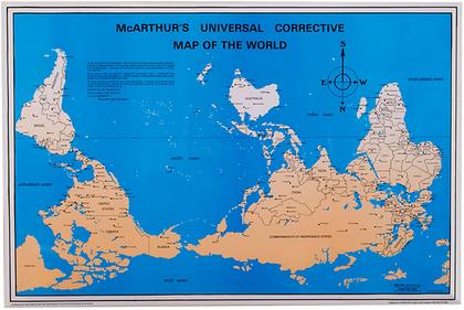
As the clip shows, some cartographers have gone so far as to create what are known as upside-down maps. For an especially original example, I offer you McArther’s Universal Corrective Map, shown below. This map was drawn by Stuart McArthur, an Australian college student who, as a high school exchange student in Japan, was taunted (geographically bullied?) by students from the United States for being born in the “bottom of the world.” Published in 1979, McArther’s map was the first modern South-Up map. His projection obviously solves that pesky north-is-up/south-is-down problem, and does so with a dose of cheeky Aussie humor.
Mapping in Relationships
So I’m thinking it is probably not possible to produce an absolutely accurate world map. Maps can never be fully objective, as they are always influenced by the perspective and interpretation of the cartographers who draw them. And, let’s face it, seeing one’s group (or self) at the center of things is a common human tendency.
I sometimes encourage a more self-centered perspective when I work with individuals in psychotherapy, because people who enter therapy have often lost their sense of self in some way. “How do you feel about this? What is your perspective? How can you get your needs met?” are all questions I hope will bring them back in touch with who they are, what they believe in, and what they want out of life.
But in my work with couples, when a dogged focus on the self often threatens to split a couple apart, I usually find myself encouraging just the opposite perspective, and I challenge both partners to imagine and use alternative maps.
Because, if you think about it, we are actually all cartographers of our relationship worlds. As we travel the geography of our relationships with important people in our lives, we create maps to help us understand and navigate them.
And, as is true for the mapmakers above, the products of our work – the maps of our relationships and the events that occur within them – are always imperfect representations that are limited by our own, biased perspectives. Because our experience and understanding of a relationship event, particularly one that involves a disagreement of some kind, evolves as much from the baggage we carry from our personal history as it does from what actually occurred at that particular moment in the room. As William Faulkner so wisely observed, “The past is never dead. It’s not even past.”
An Upside-Down Relationship Map
So, like the Europeans, we are always in danger of “othering” our partners by assuming the superiority of our own feelings and priorities. We, too, need an upside-down map to remind us that we are not the center of the world.
The first step to creating this map is to remember that in every exchange we have with our partner, there are always two perspectives, two valid experiences of reality. We both get to be right.
The second step is to really listen to our partner and try to see things from their point of view so that we can understand their personal history, their perspectives, and their goals as just as valid as our own. This particular step is kind of hard for some people (myself included) because in order to really listen you also have to really shut up.
Third, we must work with our partner to compromise when we can in order to create workable alternative maps and solutions that, although still imperfect, take into account our sometimes-disparate perspectives, bring us closer together as human beings, and preserve our ever-changing relationship.
We need to create and work with an upside-down relationship map, maps that offer a window through which we can each really see and understand each other’s history, perspectives and values. Otherwise, we will tend, like many countries, to care more about who’s right than about how we can work things out so that we all win.
———————————–
Now, I know many of you have been working successfully with upside-down relationship maps for some time. Please take a moment to share your experience with us in a comment below, so that we can all benefit from your creativity!


I think often, people believe that you must sit down face-to-face and have deep conversations for any type of true communication, but this can seem pretty threatening, especially if you’re a conflict-avoider like myself. In past relationships, I and my partner have decided that its ok to talk about big things over the phone or in an email as long as we take them just as seriously and allow for the possibility of face-to-face talk once the subject has been opened up. Although I do agree that face-to-face is best, you might not be ready for that right away so allow yourself some leeway in how you communicate with those you love.